![How to Make Charts & Graphs in Google Slides? [Complete Guide!]](https://artofpresentations.com/wp-content/uploads/2021/05/Featured-Image-How-to-Make-Charts-Graphs-in-Google-Slides.jpg)
Graphs and charts are inseparable parts of statistics. There is no better way to graphically demonstrate gradual progression or degradation of status than using graphs and charts. If you want to include bar graphs or pie charts in your Google Slides presentation, you are in luck. Google Slides has an excellent built-in feature to do that.
You can make charts and graphs in Google Slides by using their built-in feature. Click insert from the tabs and place the cursor on ‘Chart’. You will see a variety of charts to choose from. There is also an option to make graphical charts from Google Sheets.
For a proper graphical presentation, you must know the ins and outs of how to make charts & graphs in Google Slides. There are quite a few types of these like the bar graph, line graph, pie chart, column chart, etc. In this article, I will explain how you can make all of these in Google Slides. So, let’s get started!
Pro Tip – You can also use a Google Slides Charts Template to make your charts and graphs look really awesome, and make your presentation stand out!

If you want to make your charts in Google Slides really attractive (like the ones shown in the image above), make sure you check out the later section of the article!
How to Make a Bar Graph in Google Slides
A bar graph is a graphical representation of numbers, quantities, data, or statistics using rectangular-shaped bars or strips. It is also known as a bar chart. Many people often get confused between bar charts and column charts. A very common misconception is that they are the same. Actually, they are quite different.
Both bar charts and column charts use rectangular bars to represent data. The key difference between the two types of charts is in their orientation. A bar graph is oriented horizontally unlike a column chart.
Making a bar graph in Google Slides is very easy. Google Slides has top-of-the-line built-in features that make bar graphs.
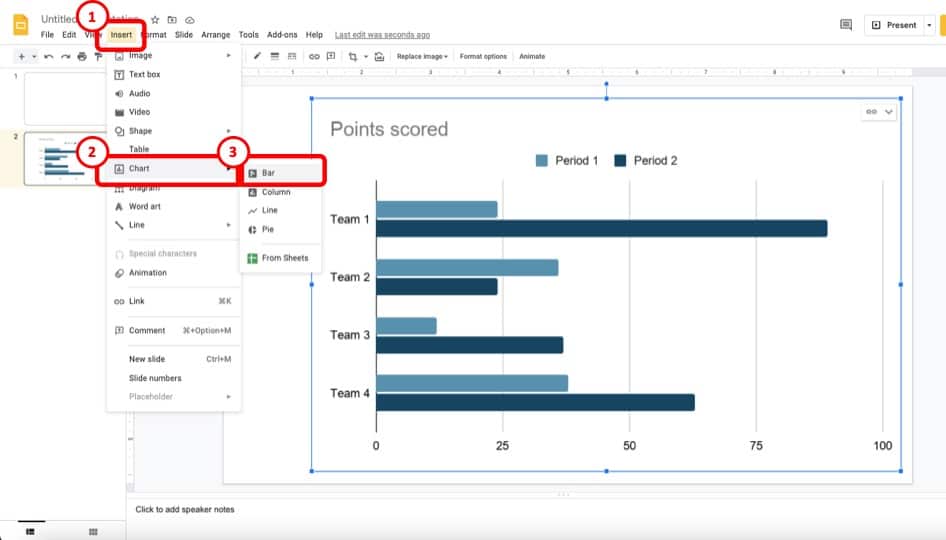
Here’s how to insert a bar chart in Google Slides
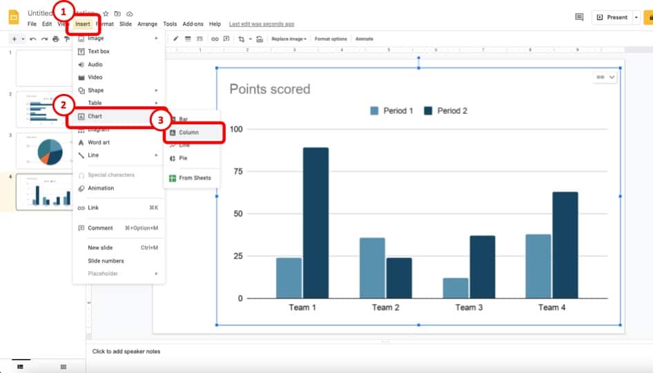
- Click on the ‘Insert’ menu from the menu bar.
- Next, click on ‘Chart’.
- Click ‘Bar’ to create a bar chart in Google Slides
- A bar chart will be inserted into your Google Slides file. Edit the source data to create a unique bar chart.
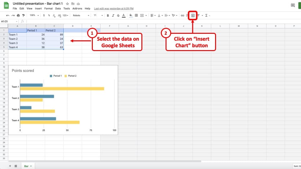
Whenever you insert a chart in Google Slides, it will be automatically linked to a spreadsheet in Google Sheets. You can access the spreadsheet by clicking on the Linked chart option>Open source.
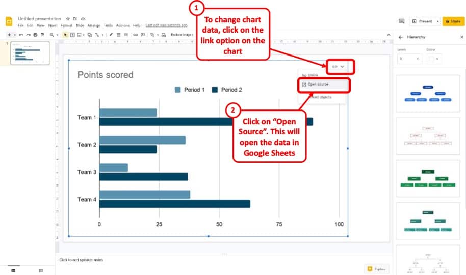
In the image above, you will be able to see how to access the chart data and edit it to create your own chart.
Click on the link button, then select “Open Source”. This will open a new Google Sheet containing the source data in a new tab. You can then edit it as per your requirement and redesign the chart.
How to Make a Pie Chart in Google Slides?
A pie chart is another popular method of graphical demonstration where a circle is divided into various sections, each section representing a proportion of the whole. The pie chart is preferred to bar graphs by many because it contains the whole set of data in a single component. A pie chart is easier to visually compare than other charts.
Making a pie chart in Google Slides is as easy as inserting any other chart.
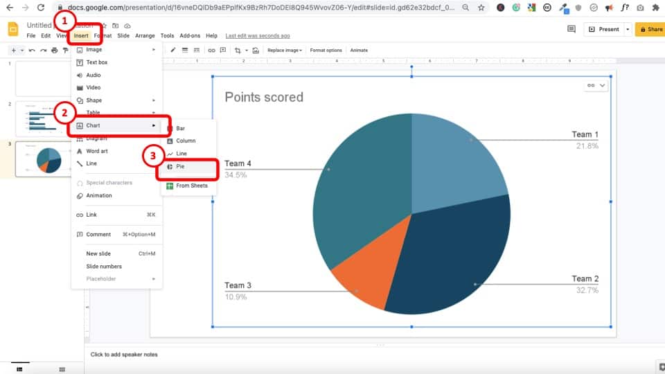
Here’s how to insert a Pie Chart in Google Slides –
- Click ‘Insert’ from the tabs.
- From the dropdown menu, click on ‘Chart.’
- Click ‘Pie’ which should be the fourth option.
- A pie chart will be inserted into your Google Slides file.
There are tons of options to customize the pie chart. You can change data range, select chart types, make changes within the pie such as changing the colors of the slices, changing the background color, and a lot more. Some features may not be even needed most of the time.
Once you insert the pie chart, go to Linked chart option>Open source.
A Google Sheets file will open with the pie chart on it. Click on the pie chart to select it. Click on the three vertical dots on the top right of the pie chart and select ‘Edit the chart‘.
The chart editor will appear on the right. From the setup tab, you can change the pie types to 3D pie chart, doughnut pie chart, etc.
From the customize tab, you can change the pie type, colors of the slice, their distances from the center, titles, and so on.
How to Make a Line Graph in Google Slides?
A line graph uses a horizontal line with progressive inclination or declination to represent changes over a period of time. Line graphs are better to present small changes than bar charts or column charts. The line chart is also used to compare changes between two or more groups over the same period.
The process of inserting a line graph in Google Slides is also quite similar. To insert a line graph in Google Slides, do the following:
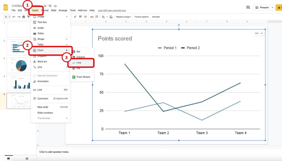
- Click ‘Insert’ from the tabs.
- Click or place the cursor on ‘Chart.’
- Click ‘Line’ which should be the third option.
- A line chart will be inserted into your Google Slides file.
A spreadsheet file will be linked instantaneously, similar to other charts. A pop-up will appear on the bottom left of your screen for a short period saying ‘Chart Inserted Edit in Sheets.’
You can click it to access the spreadsheet directly. If it disappears, you can still access the spreadsheet by clicking on the Linked chart option>Open source.
You can select various line charts like smooth line chart, combo line chart by going to the chart editor.
How to Make a Column Chart in Google Slides?
Column charts are matchless for showing comparison among several groups over a certain period. Column charts use vertical rectangular columns for data presentation whereas bar graphs use horizontal rectangular bars.
You can easily make column charts in Google Slides by following these steps:
- Click ‘Insert’ from the tabs.
- Click or place the cursor on ‘Chart.’
- Click ‘Column’ which should be the third option.
- A column chart will be inserted into your Google Slides file.
You can edit the columns similarly from Google Sheets. You can change the column types to stacked columns or 100% stacked columns.
How to Format the Charts in Google Slides?
The option to format the way the chart looks in Google Slides is quite limited.
If you want to change the color of the graph or adjust the way the fonts look or the way the title looks on the chart in Google Slides, there are some options available but they are quite a few.
So, let’s look at how you can format the charts in Google Slides –
Step 1 – Right Click on the Chart and Open “Format Options”
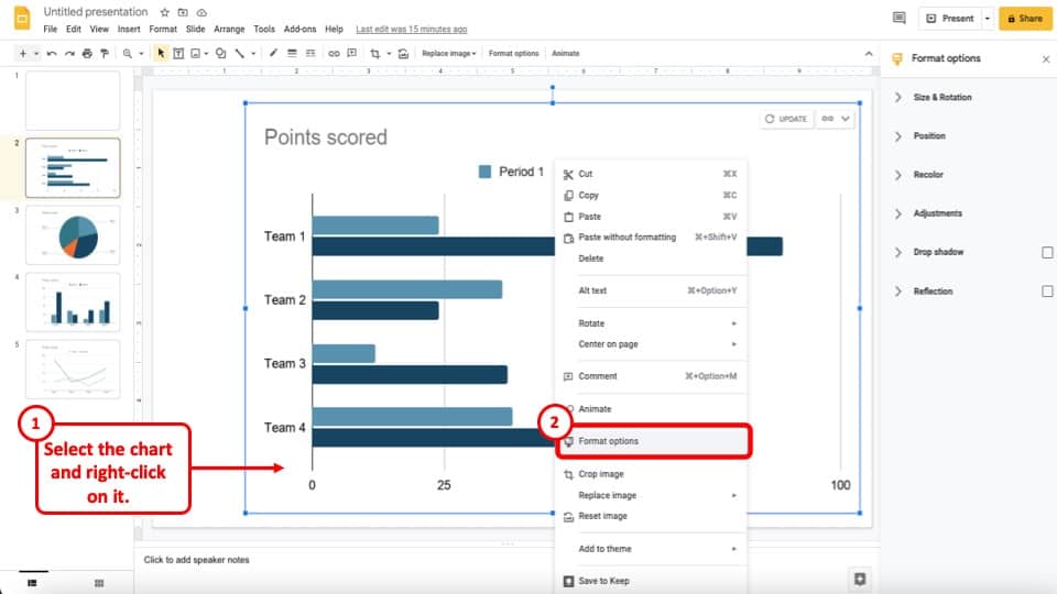
The first step to format the way your chart looks is to right click on the chart. From the pop-up menu, click on “Format Options”.
Step 2 – Use Recolor option to Adjust Colors
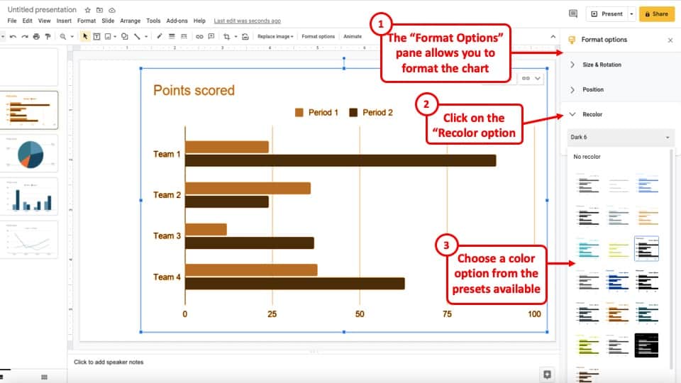
When you open the format options window, you will see more option to format the chart. The most helpful option in this menu is the “Recolor” option.
Google Slides will provide you with a few built-in presets for “recolor“. Although you don’t get to choose the exact colors, it does help you change the color of your chart.
Step 3 – Edit using the Chart Editor Option in Sheets
If you want to edit additional information visible on the chart, you will need to open the source data in Google Sheets. You can do that by clicking on the “link” button on the top right corner of the chart. Then, from the dropdown, click on the “Open Source” option.
Step 4 – Click on “Edit Chart” option on Sheets
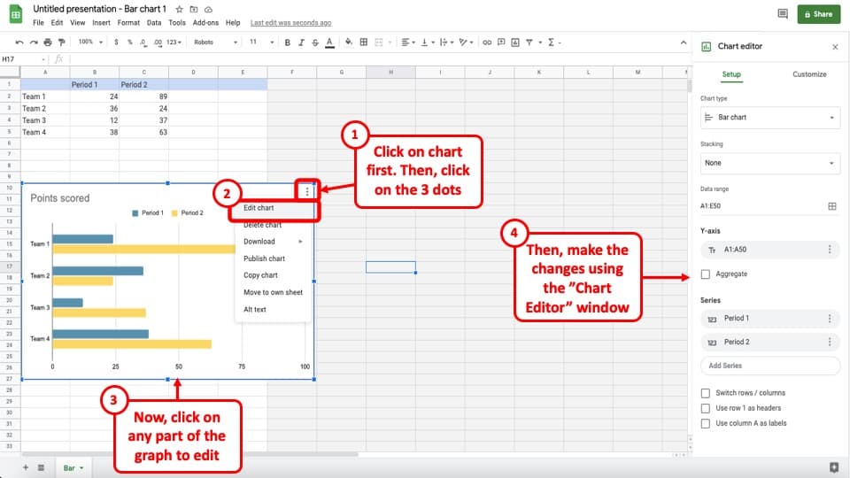
Next, when the data opens up in Google Sheets, click on the graph. On the top right corner of the graph, you will see 3 vertical dots. Click on it. From the dropdown, click on “Edit Chart“
You will notice that a new window will open on the right part of your screen. You can now click on various parts of the graph and edit the information. For example, you can change the title of the chart, change the color of a particle bar, edit the gridlines, vertical axis, legends, etc.
Step 5 – Copy and Paste (or Update) the Chart in Google Slides
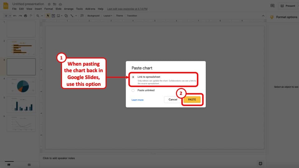
Once you are done with the changes, you can simply copy the chart from the sheets (using Ctrl+C or Cmd+C), and paste it to your Google Slides presentation. When you paste the chart back to your Google Slides presentation, make sure you select the “Link to Spreadsheet” option!
You can also go back to the original chart on your presentation and click on the “Update” option (right where the link option was previously visible on the chart in Google Slides). However, I wouldn’t advise using this option as I’ve noticed that the update option doesn’t update the chart exactly as per the formatting changes made in Google Sheets.
How to Link your Charts and Graphs to Google Sheets?
It is entirely possible that sometimes the chart has already been created or the data is available in Google Sheets and you don’t want to redo all the hardwork. In such a scenario, you need to insert the chart or graph from Google Sheets and make sure that it links to the sheets!
This is very important because you can’t edit the data of the charts in Google Slides. You must link your Google Slides presentation to a Google Sheets file where you will be able to insert and edit various data to be presented in graphical form. You can also edit the chart types from Google Sheets.
When you insert a chart in Google Slides, it is automatically linked to a Google Sheets document. You can access it by either clicking ‘Chart Inserted Edit in Sheets’ on the bottom left of the chart or by clicking on the Linked chart option>Open source.
If you want your present the data from your spreadsheet in Google Slides, follow the steps below:
- Open the Google Sheets document.
- Click on ‘Insert chart’ from the ribbon.
- A chart will be inserted into your Google Sheets file.
- You can change the chart type from the chart editor on the right side.
- Then, open your Google Slides file.
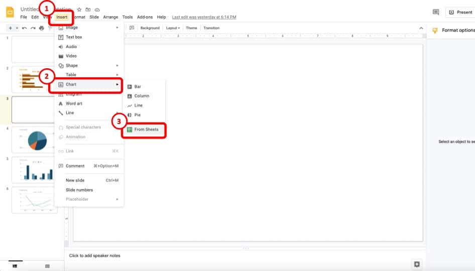
- Click ‘Insert’ from the tabs.
- Click or place the cursor on ‘Chart.’
- Click ‘From Sheets’ which should be the last option.
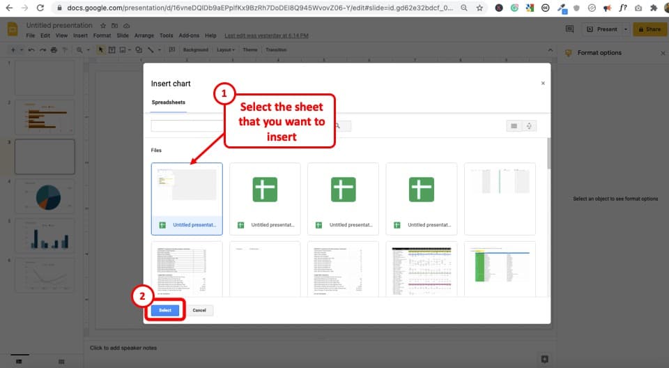
- Select the Google Sheets file that you inserted a chart previously and saved on your Google drive. (as shown in the above image)
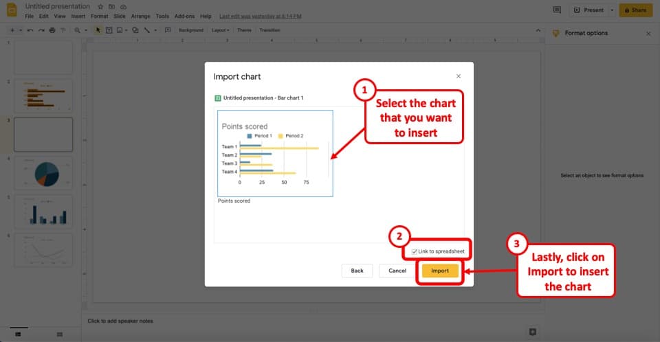
- Then, in the next step, select the chart that you want to insert, and click “Import” (as shown in the above image)
- The same data chart will be inserted on your Google Slides presentation from Google Sheets.
If you unlink the chart by clicking the Linked chart option>Unlink, you can delete the chart and insert a new one which will be linked to a spreadsheet by default.
How to Insert a Table in Google Slides?
To insert a table in Google Slides, follow the steps mentioned below:
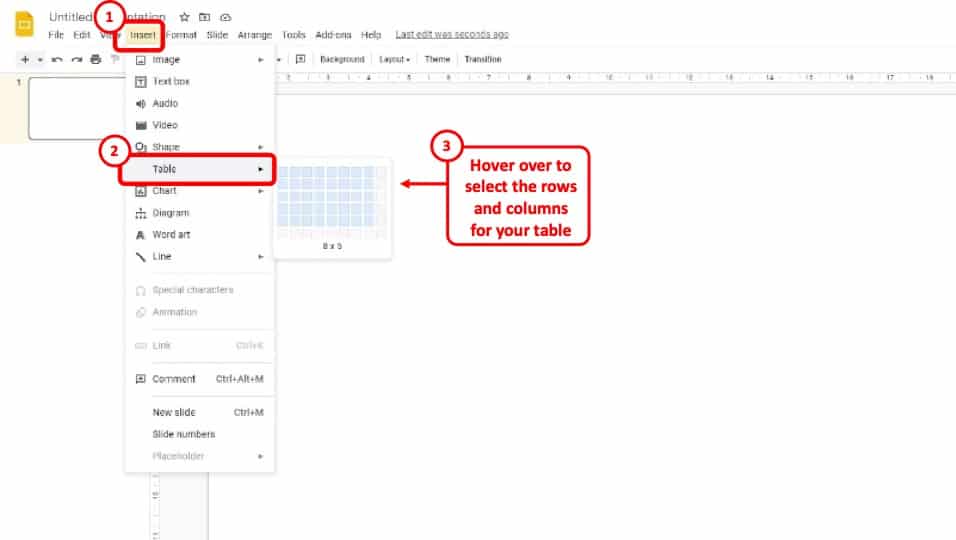
- Click ‘Insert’ from the tabs.
- Click or place the cursor on ‘Table.’
- You can choose the number of rows and columns by moving the cursor.
- Click on your desired number of rows and columns.
- The maximum number of rows and columns you can choose is 20.
How to Make Charts More Attractive in Google Slides?
Now that you’ve learned how to create charts and graphs in Google Slides, you may perhaps want to make sure that your charts, graphs, and tables look really professional. We all know that there are several advantages to ensuring that our presentations look really nice! But, how do we make our charts look out of the world?
The best way to make your charts more attractive (especially if you have basic design skills) is to purchase presentation templates from well-known platforms. Such presentation templates are inexpensive and can be used over and over again in multiple presentations.
Learning the skills to create beautiful designs takes a lot of time. Instead, how about we borrow the skills of a graphic designer and just pay a few dollars (about $5-$15) for a presentation template that can be used multiple times! I’d definitely go with the latter option if I had basic design skills.
If you choose to buy a presentation template to make your charts look good, I’ve got 2 amazing options for you. Although there are several options that are available, I’m only recommending to you the best option that you should go with. So, here are my favorite options –
1. Best Charts and Tables Collection (Google Slides V367)
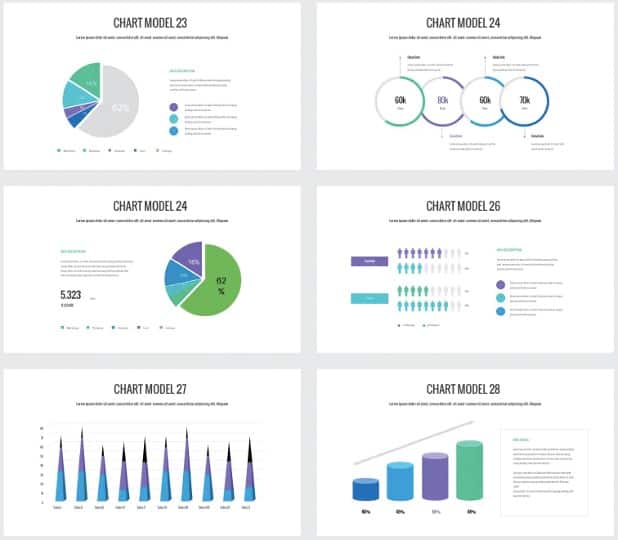
This charts and tables collection will provide you with about 75 unique slides in 5 different color combinations. It offers a very clean, and a minimal design for charts, graphs and tables.
There are more than 15 different types of graphs that are presented in the template. All the charts are completely editable. This template is designed for 16:9 widescreen slide size.
One thing that you need to keep in mind is that this template is available using Envato Elements. The pricing for that starts at $16.5/month. The good thing about it is that you can take a subscription for 1 month and download as many presentation templates as you like! There is no additional cost for more presentations you download!
This charts and graphs presentation is a well-rounded and complete template in my opinion. You will be able to achieve a lot more than just simple chart designs available in Google Slides by default.
2. KPI Dashboard Kit (for Google Slides)
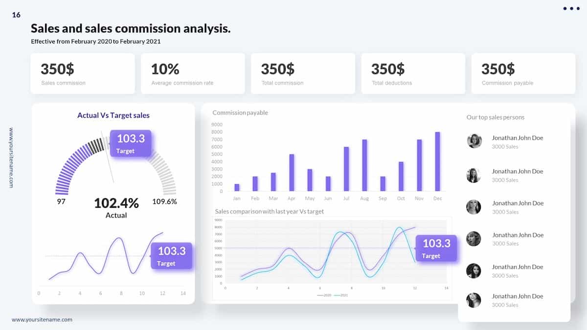
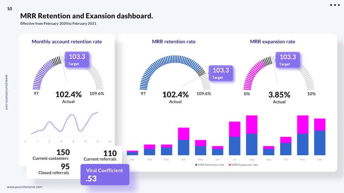

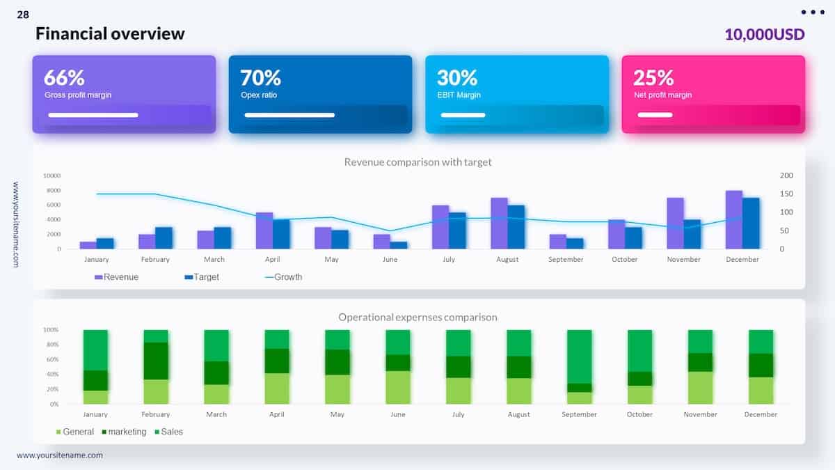
So, this is a great template to make your presentation graphs look amazing and professional.
This presentation template is mainly focused towards KPI dashboards and data representations. That said, the charts used in this presentation template are quite unique in design and look really professional.
Moreover, these chart and graph designs can be used in any presentation! So, it doesn’t really matter if you are creating a KPI Dashboard or not.
The template itself costs just $9, but there are hundreds of chart designs available in this template that can be used for pretty much any purpose! Plus, if you do use PowerPoint, this template even comes with amazing animations to make your data stand out even more!
Lastly, there are over 100 color combinations to choose from! Click on the button below to check it out!
More Related Articles
- Using Choice Boards in Google Slides – A Simple Guide!
- How to Convert Google Slides to Video [For FREE]
- Do Presentation Clickers Work with Google Slides?
- Can Google Slides Record Audio? Here’s a Quick Fix!
- How to Animate in Google Slides? [A Comprehensive Beginner’s Guide!]
Credit to karlyukav (via Freepik) for the featured image of this article