This is often a tricky question and has people perplexed at times. It is easy to get confused with all the different colors that are out there. How a human perceives a color often varies from person to person and culture to culture. Thus, simply identifying the difference between two colors can itself be very challenging to a naked human eye. Add to that the complexity of a minor variation that creates a shade which makes this topic even more confusing.
So, is a shade of a color a different color? Yes, each shade of a color is a different color in itself. You can consider a shade of a color a combination of two colors. Thus, just as you combine two primary colors to form a new independent color, a shade of a color is also an independent color.
What does a shade of a color mean?
A shade of a color is formed by adding a darker black to the color.
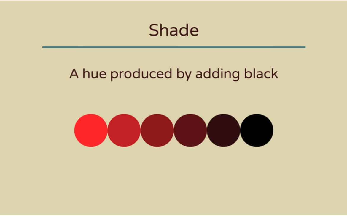
To form a shade of a color, all we need to do is add black color value to the chosen hue (base color). The subsequent variation thus formed is called a shade. We must notice that it is a variation of the same color. In other words, combining two colors – a base color and black results in a third color. This color is a darker variation of the base color. For example, if our base color or hue is red, then adding black to it will result in a maroon or dark red variation of the base red color.
What is the difference between shades and tints?
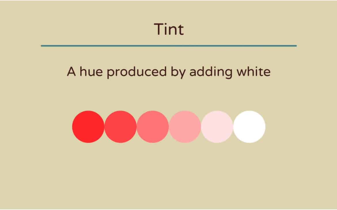
As opposed to shade, which is produced by adding black to a base color, Tint is produced by adding white color value to the chosen hue (base color). The variation thus formed is called a lighter version of the base color known as a tint. For example, if our base color or hue is red, then adding white to it will result in pink. Thus, pink is a tint of a red hue.
So what is tones and how is it different from shades and tint of a color?
Tone of a color is another way of attaining a variation of a base color
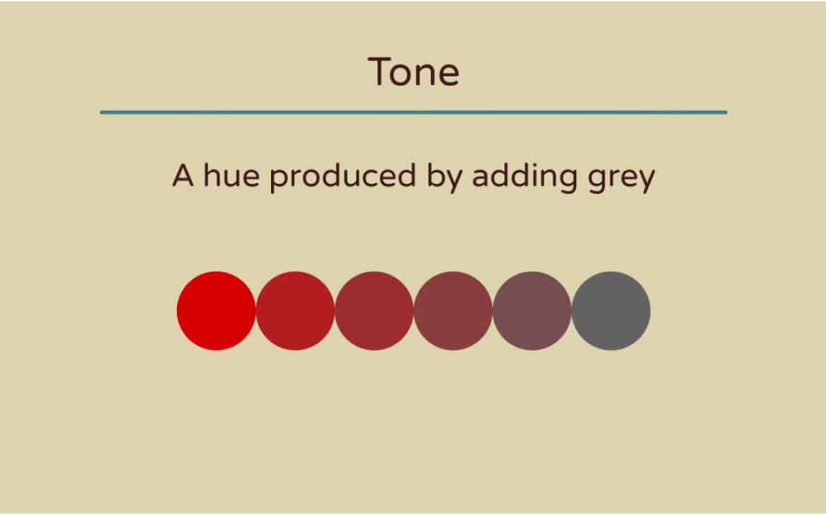
When color grey (attained after the combination of white and black colors) is added to the base color, the tone of the base color is achieved.
The primary difference between tones, shades, and tints is color that is added to form a variation of the base color.
How do you identify the difference between two shades of the same color?
It is often difficult to identify the difference between two shades of the same color. Consider the following example –
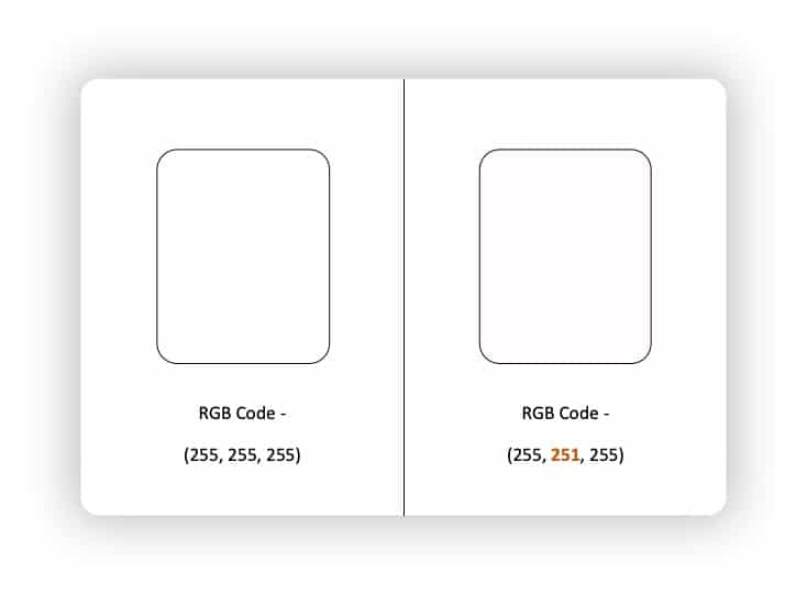
The above image showcases the difficulty to identify the color difference with the naked eye between two shapes with a marginal color difference. Only when they are put together next to each other can we see a slight difference.
The best way to identify the difference between any two colors is to compare their color values. The way a computer recognises a color is through a code or a value. Thus, each color is assigned a unique value. Two of the most common color coding systems are the RGB (Red, Green, Blue) code system and the HEX code (or the hexadecimal code) system.
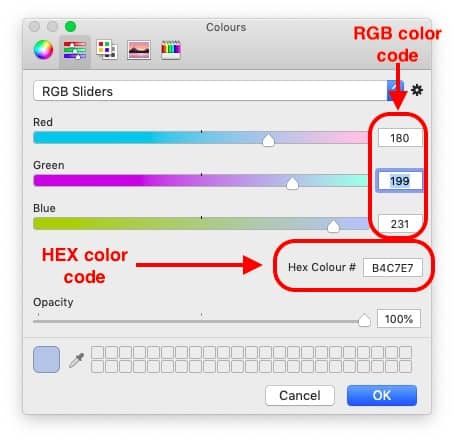
Without getting too technical, the easiest way to make sure that the two shades you are looking at are the same or different is to look at the values. In PowerPoint, you can do this by selecting a shape. Then, right-click on to and select “Format Shape”. On the Format tab, click on the “Fill options”, then click on more colors. You will notice that a window pops up containing multiple colors to choose from. You will also notice the RGB and HEX codes of the color showcased in the same pop-up window. Here, you can not just compare but also edit and make sure that color codes of both the shapes match with each other.
What does the Monochromatic Color scheme contain – a color, tint, tone or a shade?
So this is an interesting question that often arises in the minds of our audience. What happens in a monochromatic color scheme? Does this palette use different colors? Or does it contain shades of a color or is it comprised of tints and tones?

(image source – https://owlscape.in/monochromatic-color-scheme-for-powerpoint/)
Well, a monochromatic color palette is created using a single color as a base color (mono means one, and chromatic means color). The base color is used as a starting point. However, the color palette can be attained by either using a shade, tint or a tone. Each of the resulting colors is an independent color in itself belonging to the same parent or base color.
Does a color wheel help in determining a shade or a tint of a color?
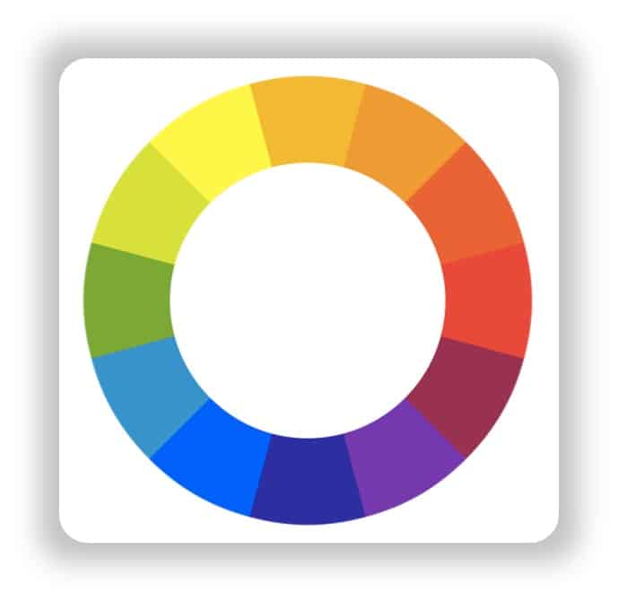
One look at the color wheel (showcased in the picture above) should be enough to give you an indicative answer to this question. A color wheel showcases a total of 12 colors which includes the three primary colors of Red, Yellow and Blue.
An important note to make is that none of the above colors are formed as a shade, tint or tone of any other color. Thus, primarily a color wheel’s objective is not to help you determine a shade or a tint but to help you create a color combination. Nevertheless, there are some versions of a color wheel that come with multiple variations of the same color with a separate option to adjust the dark, white and grey components. Still, such color wheels can only help you adjust the shade or a tint but not help you determine a shade or a tint of a color.
So, how many main colors are there?
There are a total of 3 true colors that exist. These are the primary colors of Red, Yellow and Blue. These colors are called primary colors as they are not formed by a combination of any other colors.
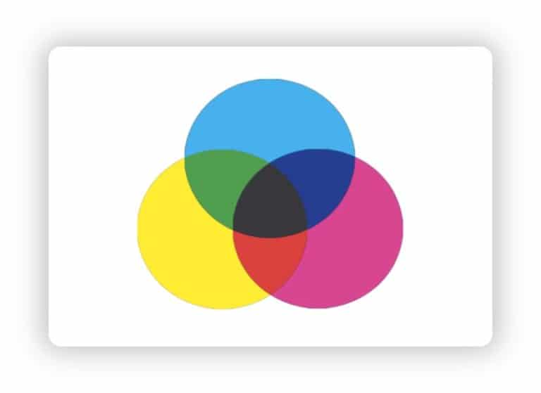
However, the next set of colors i.e. Orange, Green and Purple are formed by the combination of the primary colors. When you overlap each of the three primary colors, it forms the secondary colors.
Primary Colors – Red, Blue & Yellow
Red + Yellow = Orange
Blue + Yellow = Green
Red + Blue = Purple
Secondary Colors – Orange, Green, Purple
Likewise, the combination of primary and secondary colors gives the remaining of the six colors of the color wheel showcased above in the post.
While these 12 colors form a color wheel, combinations of these 12 colors and using black, white and grey to create their shades, tints and tones can mean that millions of colors can be generated. In theory, there are infinite colors that can exist. However, a point to note is that most modern-day monitors are able to reproduce over 16.8 million colors giving a true color of an image and make it look like it is supposed to look to our eye.
Does a shade of a color look different on different monitors?
As I mentioned above, most modern computer monitors are today able to produce over 16 million colors to create a full-color picture. Scientists estimate that our eye can capture up to about 10 million vivid colors. Thus, it is easy to conclude that our modern computer technology and monitors are able to produce more than enough beautiful colors in order to reproduce an image to feel real, original and lifelike.
However, there are times that the same color looks like a different color on a different monitor. I am sure many of you would have come across a situation where the same image opened on a different computer often looks like it has a different color in it! It is most common when comparing an image or a creative showcased on a windows computer to that showcased on a Mac monitor.
There are multiple reasons for this to happen. For example, a brand new computer monitor will display colors differently to that of a 3-5-year-old monitor simply because a brand new monitor sometimes carries a blue-ish tint over the screen resulting in some colors looking more whiter and brighter. Some of the other factors responsible for the same color to look different on different monitors could be – the type of screen used (LCD, LED or a CRT monitor, variation in the type of Graphic Card used, etc.
Why is it important to know the correct shade of a color?
Color is one of the most critical components of any design. It plays a key role especially when it comes to brand recognition, consistency in messaging or grabbing the attention of your audience by redirecting them to certain parts of the design.
It also plays a vital role in any merchandise that is created by any organisation as an object that doesn’t match the color of a certain brand can almost certainly get classified as a counterfeit!
Thus, it is important that we use the exact color or the shade of the color that represents the brand for which you are creating your design.
So, how should I capture the near-perfect shade of the color?
As we have understood, it is of utmost importance that we use colors in our designs that represent the brand and speak the language of the brand.
The easiest way to ensure that we capture the perfect color is by asking the RGB or the HEX codes of the colors that the brand uses. It is always mentioned in the brand guidelines of a particular brand. In a rare scenario, where it is not mentioned in the brand guideline or the brand hasn’t created a brand guideline, it is best to ask the brand about the specific color codes used by the brand.
However, there are times that even that is not possible. An organisation may request you to create just a sample for which they don’t want to share any color combinations. Or, there may be a situation where you want to match the color used which is not necessarily a brand color. The easiest way to grab the near exact match in such cases would be to use a color picker tool.
There are several color picker tools available on the internet. Some are paid, while most are free. In fact, even PowerPoint has its own inbuilt color picker tool.
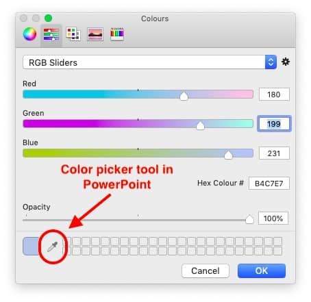
If you refer back to our steps in order to identify and change the HEX and RGB color codes. The same pop-up window also carries this small dropper (as indicated in the image above) known as the eyedropper tool in PowerPoint. In order to open this pop-up window, simply select any shape, right-click on it and choose “Format Object”. Then, under “Fill” options, click on color. On the color options, select “More color options”. Upon clicking that option, you will notice a window pop-up as represented in the image above.
Once you see this window, simply click on the eyedropper tool. Your cursor will now get enlarged and you will see a relatively big circle instead of your cursor. Simply hover over the color that you would like to use and click on it. You will notice that the eyedropper tool will now keep this selected color option for you to choose from.
In this manner, you can choose a near-perfect shade of a color from another shape or an object.
Conclusion
It is safe for us to conclude that a shade of a color is indeed a different color albeit that looks very similar to the base color. I hope through this blog post, we have understood the concept and the difference between the shades, tint, tone of a color. I also hope we have understood why it is important to use the correct shade of a color while creating a design for a brand, and how to choose the right color using a color picker tool in case we don’t have the color codes.
Our goal on this blog is to create content that helps YOU create fantastic presentations; especially if you have never been a designer. We’ve started our blog with non-designers in mind, and we have got some amazing content on our site to help YOU design better.
If you have any topics in mind that you would want us to write about, be sure to drop us a comment below. In case you need us to work with you and improve the design of your presentation, write to us on [email protected]. Our team will be happy to help you with your requirements.
Lastly, your contribution can make this world a better place for presentations! All you have to do is simply share this blog in your network and help other fellow non-designers with their designs!
