
A good first impression can have a lasting impact. Thus, having a good design for your first slide is important. We’ve seen that people often simply put the title of the presentation as a first slide. I personally dislike this the most. It just shows that the person creating the presentation was simply not interested in it (even though that may not necessarily be true).
Thus, knowing how to create a good first slide is as important if not more as knowing how to create the rest of the presentation. The best part is – you can easily create an awesome first slide for your presentation in minutes in a few quick and easy steps. Obviously, if you have the time at hand, you can easily spend an hour or two making that perfect first slide! In this post, we take a look at how to easily create a first slide with a few examples of actual designs that we have created for our clients.
1. What is the first slide of a PPT presentation called?
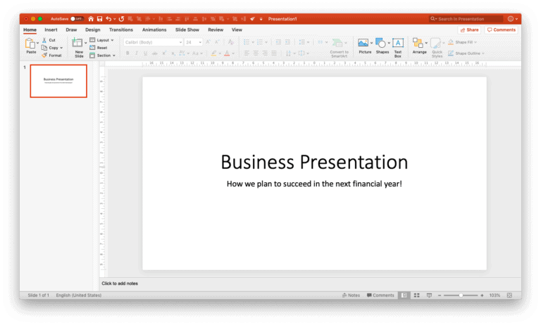
The first slide of a presentation is called a “Title slide” or a “Cover slide”. This slide often contains the title of the presentation and hence the name title slide. It is also often referred to as the “Opening slide” of the presentation. The title slide is often the slide that is displayed on the screen before you start your presentation. Thus, it is important to have a title slide that not only looks good but also shares relevant information about your presentation.
2. What content should be included on the first slide of the PPT presentation?
A title slide or the cover slide does not need too much content. The purpose of the title slide is really to give an indication of what the presentation is all about. Thus, an ideal title slide should contain nothing more than –
- Presentation title
- Date of the presentation
- Presenter’s name and designation
It is not necessary to have all the above three pieces of information on a cover slide. Do keep in mind that not all cover slides are the same and what content is displayed on the cover slide can be organisation specific. An organisation may have a preference or a fixed structure for the content that needs to be put on a cover slide. This may vary from the above structure.
3. How to easily design a beautiful first slide in minutes?
As I mentioned earlier, having a good first slide can have a lasting positive impact on your audience. Thus, it is important to create a good design for your first slide. There are several ways you can design the cover slide. Let’s look at some of the easiest ways you can create a beautiful cover slide –
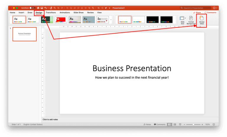
Method 1 – Using PowerPoint’s “Design Ideas” functionality (for beginners)
I must admit, PowerPoint’s “Design Ideas” functionality has great potential. In fact, we at OwlScape were planning on creating a similar plugin for PowerPoint users before Microsoft introduced this feature. This functionality is not just great for beginners, but also at least a must try for intermediate level users too. Designers from OwlScape also at least check out the functionality every once in a while especially when we hit a creative bloq.
It is really easy to work with. In just a couple of clicks and a few minutes, you can make your title slide look completely different –
Before

After

To do this, all you need to do is put some text on your cover slide and use the “Design Ideas” functionality of PowerPoint. For example, you can write the title and subtitle of your presentation.
Next, click on the “Design” tab on your Menu bar. On the ribbon under the design tab, look for “Design Ideas” feature. It is normally on the far right of the screen on the ribbon. Click on it, and wait for a bit.
In a few seconds, PowerPoint will automatically throw a few ways in which you can design your title slide. You can choose the design you like, and repeat the process to get more results.
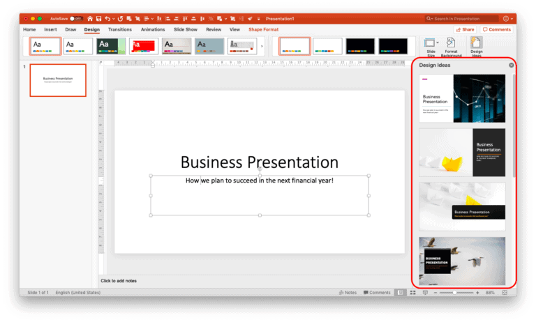
If you are unable to see any design ideas or you get an error, you could close the error result by clicking on the close button marked with “X” next to Design Ideas. Then, try clicking in any of the text box on the slide and click on “Design Ideas” again. A few attempts will surely give you some interesting results.
There are a few drawbacks though. These are as follows –
- The results are not consistent. If you happen to delete the slide and try to recreate using the exact same process, the result may be different. This can be both good and bad 🙂
- Editing the design of the suggested slide may not be easy for beginners – when you need to make some changes to the chosen design option, it doesn’t happen directly. You will need to work with the master slides in order to make the design changes. This may seem daunting especially if you are a beginner.
- Sometimes, it just doesn’t work – Even though you may have created a slide using the same content before, sometimes when you try to recreate using the same content, it may simply fail to showcase any ideas. In such an event, we would advise you to click on the text box or an image on your slide and try again by clicking on the Design Ideas option.
- Available for Office 2016 onwards – If you are a PowerPoint user using an older version of Microsoft Office, you may not be able to easily access this functionality. Having the latest PowerPoint version can be of great help!
One thing to note is that the “Design Ideas” option can be used not just for the cover slide, but also for other slides. However, I would advise resisting the temptation of using it for every single slide. 🙂
Method 2 – Using shapes to create an interesting cover slide (for intermediate users)
One other way of having an interesting cover slide is by using the shapes in PowerPoint. Let’s look at the following example –
Before

After

If you look at the above example carefully, you’ll notice that we’ve only added a shape to the already existing title and the subtitle in the “After” slide. Simply adding a shape, a logo and aligning the text can alter the look of the slide drastically.
There are many ways you can add a shape to the slide. My favourite method is to add a horizontal or a vertical “Trapezoid/ trapezium” (a quadrilateral shape with one pair of parallel sides). A trapezoid shape allows me to have enough space to write the title of the slide and some more content.
To create this shape, you can follow the below steps –
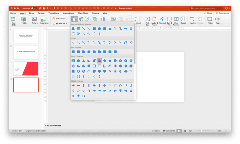
On the menu bar, click on “Insert” and then click on “Shapes”. Under the basic shapes option, select the trapezium shape. Next, create the shape on your slide.
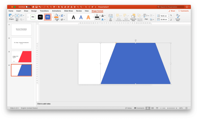
Make sure that the size of the trapezium is good enough to cover about ⅔ parts of the slide. Also ensure that the parallel sides of the trapezium touch the top and bottom part of the slide. Now all you need to do is add the title and subtitle, along with the logo to create your cover slide.

Similarly, you can also use the trapezium vertically. You can also use various types of shapes on your cover slide. The possibilities are literally endless!
Method 3 – Using shapes with images to create an awesome cover slide! (for advanced users)
If you are still not satisfied with your cover slide, there are several other ways you can make it look even more impressive. The easiest way to take it to the next level is to use images in combination with the shapes.
Let’s look at a few examples –
Combination cover slide design example – 1

In the above design, a shape has been created in the background using a freeform tool. Next, two appropriate images have been identified and put in front of the shape. All this has been kept predominantly to the right side of the slide allowing space to write the title, subtitle and the other relevant information on the left.
Combination cover slide design example – 2

In this example, we’ve used one corner of curved rectangle shape to create an interesting design. Two copies of the same shape have been considered. The one below is filled with a colour and tilted at a slight angle. The one above has an image inserted in the shape.
Combination cover slide design example – 3

In the above example, a combination of several shapes and images are used to create a visually pleasing design. Obviously, this may not be something that a beginner can create right of the bat. But the reason we put this design as an example is because barring the design skills (knowing what shape to include and where), creating this slide is not as advanced as you might think. This slide has been created by only using shapes and image elements along with the logo and text. The purpose of using this as an example was to showcase the endless possibilities on how a seemingly complex cover slide can be made by merely using basic shapes and images.
4. How to find images for the first slide of your presentation?
Whether you are using a combination of images and shapes or simply using an image on your title slide, it is important to identify a good image that resembles the topic of your presentation. Consider the following example –

If you’ve been following along, I’m sure you would have noticed by now that the above title slide has been created using a combination of images and shapes. Again, the design can be easily created using shapes and image elements. However, part of the reason that makes this slide look good and relevant to the presentation is the choice of image. Since the presentation is for a corporate organisation, choosing an image that resembles a corporate environment would be relevant.
Take a moment to scroll up and notice the other cover slide examples that I shared above.
The cover slide example 1 was designed for a presentation on education. Thus, choosing an image that represents education effectively communicates to the audience that the presentation is something to do with education even without the word “education” in the title or the subtitle or anywhere on the slide (Don’t resist, go ahead and have a look at the slide again! 🙂 )
Likewise, example 3 uses a mobile device in the title slide giving an indication that the product being talked about in the presentation is likely going to be an app.
Thus, choosing an appropriate image is important as it subtly communicates the message to the audience.
Finding the images for your presentation can take some time. You can use Google to see a few references on what type of images can be used. Avoid the temptation of using Google images directly on your presentation as this can violate copyright laws. We wrote a detailed post on where to find and how to use images for your presentation (link – https://owlscape.in/can-i-use-google-images-for-my-presentation/). Be sure to check it out!
Conclusion
I’m sure by now you’ve noticed a few different ways you can create a good title slide for your presentation. I hope this post helps you to think out of the box while creating the title slide of your next presentation. I also hope that going forward you will surely give enough focus on creating an impressive first slide even if you only have a few minutes.
If you’re struggling while creating your next title slide or your presentation, simply drop us an email on [email protected]