
Designing a presentation can take a lot of effort, especially if you are a beginner. All the options that software like PowerPoint presents can be overwhelming. Add to that the design skills needed to create a presentation. Not everyone is blessed with the aptitude and the skills to design. Despite this, anyone (including a beginner) can create attractive presentations almost every single time!
We strongly believe that anyone can create a beautiful presentation; even if you are a beginner. In today’s article, we share our mantra for creating absolutely beautiful and attractive presentations almost every single time!
You don’t need to know all the advanced features of PowerPoint. Just keep in mind the steps that we have mentioned below, and you will have a much better-looking presentation than you imagined it to be.
Tip 1 – Create an awesome Title Slide for an awesome first impression

We extensively covered a few methods using which you can easily create an awesome title slide for you PPT (link – https://owlscape.in/how-to-easily-make-an-awesome-first-slide-in-powerpoint)
A title slide is the first slide of your presentation. It mostly contains the title of your presentation and also showcases the topic on which your presentation is based. The title slide is also often the slide that is displayed even before the start of your presentation. Thus, it is important to have an awesome title slide as it can create a good first impression which can lead a subtle positive bias in the mindset of your audience. This can set the tone for the rest of your presentation.
However, creating a title slide can be challenging for some. This can be difficult especially if you are at a beginner level. In one of our previous post, we extensively covered a few methods using which you can easily create an awesome title slide for your PPT (link – https://owlscape.in/how-to-easily-make-an-awesome-first-slide-in-powerpoint)
Tip 2 – When using color, stick to the basics
If you think that simply adding text on a blank PowerPoint file means that you haven’t chosen a color scheme, then you can not be any more wrong! By simply adding text that is black on a default white background of a PPT file in itself creates a contrast and thereby a black and white color scheme! Obviously, that is not enough as that is the most basic color form which helps us read the content.
Colors are an important part of our life. Same is the case with a presentation. Every presentation needs to have colors on it. Using colors on a presentation can bring life to an otherwise lifeless looking presentation. Colors can help differentiate an important piece of information in an overcrowded content mix.

Consider the above image. Do you notice the colors used for the slide? Also, do you notice any issue with the slide? That’s correct! Grey and white text is difficult to read on a similar background in the above image.
Adding colors to your slides can often grab your audiences’ attention. However, this holds true only if the colors are used appropriately! Not knowing or not using the right color choice can equally easily distract or thwart your audiences’ attention. It may also make your presentation a bit distasteful. Not to mention the difficulty that can be caused in reading the text.
Choosing a color scheme can depend on a lot of factors. If you don’t have experience in design, choosing a color scheme can be a daunting task! There are primary colors, secondary colors, tertiary colors. Then there is a hue, tint, tone, shade and other similar terminologies to deal with. Add to that the color combinations such as complementary, split complementary, triads, tetrads etc.. This can all be very confusing!
As a beginner, the easiest way to choose a color combination is to go for a monochromatic color scheme. You CAN NOT go wrong with a monochromatic color scheme.
So what is a monochromatic color scheme? A monochromatic color scheme is a set of colors which are essentially shades of a single color (technically, they can be shades, tints or tones which give multiple variations of a single color).
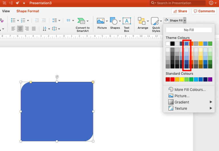
So how does one use a monochromatic color scheme in PowerPoint? Well, it’s pretty simple! When you choose the color of a particular element on the slide through the “Shape Fill” option, simply choose colors from a single set. For example – in the above image, you may want to select a color of your choice such as blue, and then use variations of just blue throughout your presentation. However, be sure to maintain contrast between the text and the background color. This means, if the background is dark blue, be sure to make the color of the text as white or light shade of blue and vice-versa.
Remember, choosing a color scheme is important, however, maintaining consistency throughout can set your presentation apart and make it look professional. For instance, if you choose a color scheme for the heading of a slide, be sure to stick with it throughout the presentation.
Tip 3 – Introduce Contrast
So now that you have chosen a color scheme, it is important to use the color scheme to create a visual appeal. Using the same colors on every single slide with the same white background can also sometimes create monotony. This is especially true if we are using a monochromatic color scheme. One such way to combat this is to introduce contrast.
Introduce contrast by reversing font color on a slide
In the previous point, we touched upon the importance of maintaining contrast between the text and the background. This not only makes the slide visually appealing, but also makes the text easy to read. Let’s look at an example –

In the above slide design, the designer has very judiciously created contrast on the slide. Use of white fonts on a darker background makes the text stand out. Likewise, using the dark colored font on a white background creates a great balance and an interesting contrast. Introducing such contrast can enhance the visual appeal of the slides.
Also note the consistency in the color of the icons. While having white colored icons on a blue background wouldn’t be wrong, ensuring that the icons look consistent makes the presentation design very professional.
There are multiple ways to create a contrast on a single slide. Using 2 or 3 variations of the same color for different elements can be another method. However, the aforementioned method is the simplest and easiest to follow for beginners while creating a stunning visual appeal.
Introduce contrast using a contrasting slide
Another method of introducing contrast in your presentation is to use a contrasting slide. While, introducing contrast on a slide by reversing font color is important. Even so, having the same background throughout the presentation can make the PPT monotonous. In such a scenario, we can have a complete slide with a contrasting color to that of the other slides in the presentation. Let’s look at an example –

The above slide added in an array of slides with white background can help break the monotony and break the contrast on our presentation. However, choosing the right slide for such a contrast is important. A general rule of thumb could be to pick the slide with just a few words or a single sentence. Such a contrast can also be introduced if we intend to have a quotation in our presentation.
One important point to note here would be to ensure that we use the primary dark color that we chose while selecting our monochromatic color scheme.
Tip 4 – Choose these fonts
One of the most important aspects of your PPT is the content of your presentation. The content that you would like to communicate can be presented using one of thousands of font choices! (Yes, you read it right! There are literally thousands of fonts out there!). So, how do you choose a font?
A simple rule of thumb is to pick fonts that are clear and legible; fonts that won’t tire the eyes of the reader even with extended looks at your slides. This is especially important when we can’t avoid a few content heavy slides.
Font Styles –
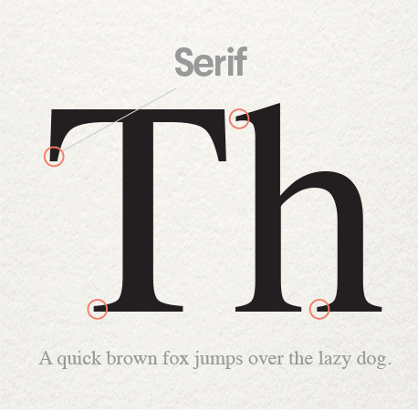
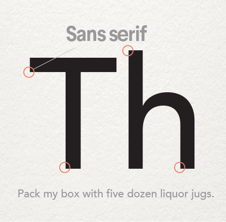
There are various font styles. However, the two most common font styles that we should most definitely consider are Serif and Sans Serif.
(source)
Serif fonts have little strokes called “serif” attached at the end of each letter. Serif fonts give a more traditional feel. They are classy, literary and high-end. Serif fonts have been used in books and literature for decades. They are highly legible and our eyes are accustomed to it. These fonts are a great choice if you intend to have too much of text on the slides (note – we generally do not recommend having too much of content on the slides)
Sans Serif fonts don’t carry the strokes at the end of each letter. “Sans” has been derived from the French word “Sanz” which literally means “without”. Thus, the name itself means without Serif. These font types are more modern, and give a clean and a sleek look to your slide designs.
So, which font to choose?
If you wish to go with Serif font type, we recommend Times New Roman. If you think your preference is to go with Sans Serif fonts, we would recommend choosing Calibri or Arial. However, there is no right or wrong. At OwlScape, we do not prefer having too much text on the slides which give our presentations a much more modern feel. Therefore, our default font preference ends up being a Sans Serif font.
A common school of thought is to consider these fonts very boring. However, the reason we not just recommend these to others but in fact also use these fonts in our own presentations is because these fonts work. Times New Roman is a serious and a reliable font, and Arial is a professional font. You simply can’t go wrong with these. They are not boring. Rather, they are safe.
However, if you wish to go beyond these fonts, my next best recommendations would be to use Merriweather (Serif), Roboto (Sans Serif) , Montserrat (Sans Serif) or Source Sans Pro (Sans Serif). Each font has its own characteristic, pros and cons. Use of fonts is an art in itself. Thus, for beginners, we always recommend using Times New Roman, Calibri or Arial.
Keep these things in mind while choosing the fonts
It is important to remember a few things while working with the content on your presentation. They are as follows –
- Choose one font – As a beginner, it is easy to fall into the temptation of using multiple fonts. Using multiple fonts is not a crime. But, it does require a good bit of understanding of the science behind it and the complementary layout in which it can be used. Thus, until you’ve mastered the use of one font, I wouldn’t recommend using multiple fonts in your presentation.
- Alignment – A common problem across presentations is the alignment of the text. My recommendation is to keep the text left aligned. Why? Because the most natural way our eyes read text is from left to right, and top to bottom. Thus, text which is left aligned is easier on the eyes.
- Use Bold font selectively – When we use bold version of the fonts, we are simply increasing the weight of the fonts. The purpose of making the fonts bold is often to guide the attention of the audience. Thus, if the words to be made bold are not chosen wisely, it can defeat the very purpose of using bold fonts. As a rule of thumb, using headings and/or sub-headings, features, important words, and numbers are a good choice to be made bold.
- Font size – Choosing the right font size can be challenging. This may vary significantly based on your audience size, and the manner in which the presentation is delivered (large audience or small screen through email). A general rule of thumb would be to go no less than a 30 point font size.
- Choose standard fonts – If you choose to go beyond the three fonts that we have recommended above, ensure that the fonts you choose are standard fonts. This means, they are either part of the Google fonts (for online presentations) or the Microsoft Office font family. You can still choose other fonts, however, do remember to share the fonts that you have used when sharing the presentation file with your colleagues or client. Otherwise, in the absence of the fonts you used, PowerPoint will substitute the presentation with alternative fonts and this can greatly alter the design of your presentation.
Tip 5 – Use images in your presentation
Almost everyone will tell you that using images for your presentation is important. Heck, I’m sure you would have seen at least one of those many TEDx presentations that only have pictures on their PPT.
So why is that? Why is using images in your PPT presentation important? Using images in your presentation is important because it enhances the look and feel of your presentation. Images also increase the retention capability of your audience as our human mind can better retain content when it is related with an image. Moreover, using images judiciously helps break the monotony of the presentation. Sometimes, use of images in your presentation also help to explain the concept better.
Images can make a good presentation great. The importance of using images can not be stressed more. But, when should you be using the images on a slide? Should you use an image on every single slide? While some events like the TEDx format may demand that, but obviously, using images on every single slide may not be the right way to go about making a presentation.
When to use images?
You don’t need an image on every single slide. But there are a few areas where you may want to consider using an image. Let’s look at a few of these –
1. Title slide –

In general, title slides don’t have a lot of text. In such a scenario, simply having plain text in an otherwise blank slide can make it boring. This makes it a perfect slide to have an image on.
2. Product slide –

When talking about your product or a feature of your product, it can make a significant impact when your audience sees the product that you are talking about. Again, a great slide to use images on.
3. Team slide –

There are two ways you could use an image on this slide. If you are introducing an individual member of your team, then having small profile pictures of your team members can be a good idea. Alternatively, you could also use a group photo on your presentation for a team slide.
4. Events & exhibitions –
If you want to talk about the events that your company did, then one of the best ways to do that is to showcase a couple of photos from each event.
5. Office/ site locations –
Some organisations have fantastic offices. If you are an employee of one such organisation and want to talk about features of your office or manufacturing site that offer great benefits for the employees, use pictures!
6. Clients/Partners –
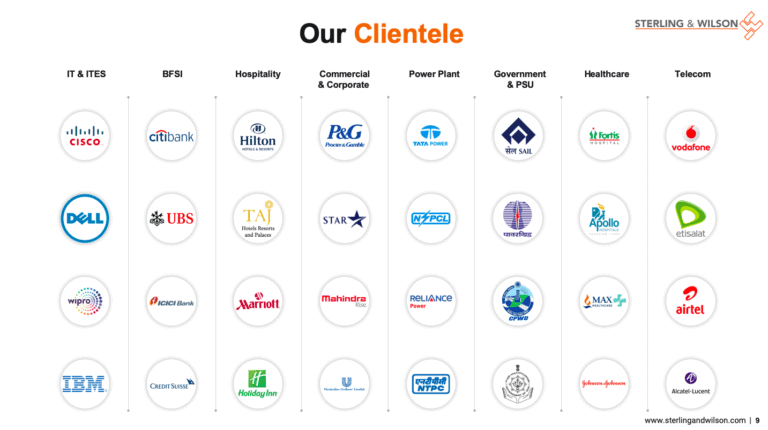
When people talk about using images on their PPT, they often forget that using logos of companies that they have worked with also constitute as images. This can be a great way of using images to enhance visuals of your presentation as opposed to just writing a list of client names.
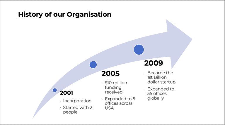
7. Explaining a concept –

(Image source) Drag the divider to the left or the right to see the complete image
Sometimes, concepts are better explained visually. Simply having a powerful image can easily and quickly convey the concept to your audience.
The above list is not exhaustive. It is only indicative in nature. There are several other ways and slides on which you can use images. Again, there is no right or wrong, and it is not necessary that you use images for each one of the points mentioned above.
How to find images for your presentation?
There are multiple ways to find an image for your presentation. Here are the top 3 methods that I recommend –
- Using Online Images in PowerPoint – Microsoft has this inbuilt feature within PowerPoint that allows you to get royalty free images from the web directly in your presentation. To use this tool, simply click on “Insert”, then click “Pictures” and select the “Online Pictures” option. You can then simply search for the image that you are looking for.
- Using free image websites – While you can buy images from several different websites, there are a few sites that allow you to get high resolution royalty free images for free. My favourite website is Unsplash. It has got some really cool images, many of which I have used in the actual presentations created for clients.
- Using free, legal Google Images – Is it really free and legal? Our recommendation is to always stick to the paid websites if possible. If that may be difficult, as much as possible, refrain from using Google Images even though some might be license free to use.
Finding the perfect image for your presentation can be time consuming. In one of our earlier posts, we shared detailed insights on where you can find images for your presentation. Be sure to read more on this topic from this link – https://owlscape.in/can-i-use-google-images-for-my-presentation/
Do’s and don’ts when using images for your PPT
Now that we’ve understood why to use images and which slides to use the images in our presentation, it is important for us to remember a few things when we work with images. Let’s have a look at these points –
Do’s –
- Use legal images – We can’t stress this enough. When you use images for your presentation, please ensure you have legal rights to use the images. Ensure that you give credit wherever it is due.
- Use relevant images – Okay, I agree. This is a bit obvious. But, I’ve seen a lot of people making this mistake. Images that are not relevant can simply fail to make an impact on your audience. If you are struggling to identify what image would be relevant, a simple Google search on the topic name can help you understand what kind of image should be used.
Don’ts –
- Don’t use images that are pixelated – Often, in search of that perfect picture, you may come across images that don’t have a good resolution. As a result, they get pixelated as soon as you put the presentation on a big screen. Ensure that the pixel density is at least 150 dpi for on screen output (ppt viewed on small screen when shared through email) and 300 dpi for a projector output.
- Don’t change the aspect ratio – Don’t change the aspect ratio of the original image. This makes subjects in the image look all weird. The easiest way to avoid this problem would be to lock the aspect ratio. You can do this by selecting the image, and right click, then select “Format Object”. On the format options, click on “Size & Properties” and ensure that there is a check mark for “Lock aspect ratio” option.
Tip 6 – Replace bullets points in your PPT with these
This is a cool tip! I assure you, just by following THIS ONE TIP, your presentation design will take a jump ahead of a vast majority of the presentations out there. Trust me, this will set you apart.
The problem is that over 65% of the world’s population falls in the age group of 15 – 64 years (source). You might be wondering what’s that got to do with bullet points? The thing is that about 90% of this population is responsible for creating presentations, and most of them learned making presentations about 5-10 years ago. This is the period when making bullet points was considered the best way to present the content. So, while the software itself has evolved during this course of time, the skills to present the content hasn’t. While, this is a problem, the cool thing is that just by overcoming this one little challenge, you are ahead of at least a good 50-55% of the presentations that are created every single day!
So what can you do instead of using bullet points? There are broadly 3 ways in which you could get rid of your bullet points. Let’s have a look at them –
Option 1 – Use PowerPoint’s built-in SmartArt function
This is by far the easiest way to replace your bullet points. Microsoft PowerPoint created the SmartArt function with this particular objective in mind. All you need to do is open a blank slide, click on “Insert” tab, then click “SmartArt”, and choose the type of SmartArt that you would like to insert depending on the type of content you have on your slide.
There are a ton of varieties of SmartArt that you would be able pick and choose. You will almost always find an option for the type of content you are having on the slide.
SmartArt is easy and fast. However, while this is great if you are starting out in the world of presentation design, we do not use SmartArt in the designs that we create for our clients at OwlScape. If you have a bit of time at hand, and have a fair idea of working with shapes on PowerPoint, we would strongly recommend using the following methods.
Option 2 – Use Icons as an alternative to bullet points
Icons can easily serve as an alternative to bullet points on PowerPoint. Using icons can be a great way to make your presentation slides visually appealing. The objective of using icons on a PowerPoint slide is really to communicate the point quickly and visually. Thus, it is important to use an icon which is relatable to content.
If you have multiple bullet points, simply identify the key message from each bullet point. Then, identify and search for an icon applicable for that key message. Next, find a simple way to represent it on a slide. The easiest way to do this is to insert a shape, could be rectangle, square, curved square or a circle, and put the icon over the shape. Make sure that the icon is not the same color as that of the shape. I usually recommend using white color icons and changing the color of the shape.
You obviously don’t have to create the icon. You can easily find it in a few quick steps. Simply go to the “Insert” tab, click on “Icons”, and search for the icon you are looking for from the bar that opens up on the right side of the screen.
Option 3 – Use Infographics as an alternative to bullet points
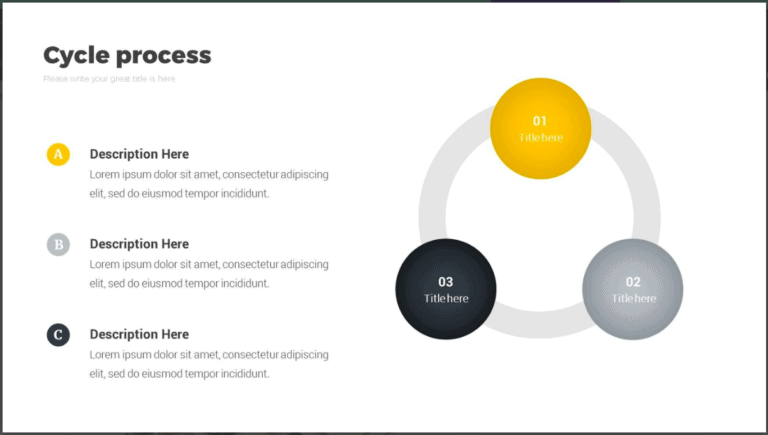
A slightly more advanced method is to use infographics to replace bullet points from your content. Just like icons, infographics add a significant visual appeal to your presentation design. If you have a decent understanding of how to work with shapes, you can easily create infographics for your PPT presentation as well.
In case you are struggling to create your own infographics, you can also buy templates online for a few dollars. There are several websites that can help you find paid infographics.
Tip 7 – Follow the rule of thirds for slide design
This is another great tip that is often missed by most people who create a PowerPoint presentation. The rule of thirds is a concept which has been derived from Photography. Thus, it is obvious that most presentations tend to lack this basic design principle.
Consider the below images –

(Image source) Drag the divider to the left or the right to see the complete image
Which one looks better? Most of us would find that the content laid out in the image on the left is better of the two. Why? The answer is simple. It is because the design on the slide follows the rule of thirds.
So what is the rule of thirds in PowerPoint? The rule of thirds is a design principle where content is designed and laid out in a way that it follows any combination of a 3 by 3 grid system. Using the rule of thirds in slide design ensures balance to the design of the slide.
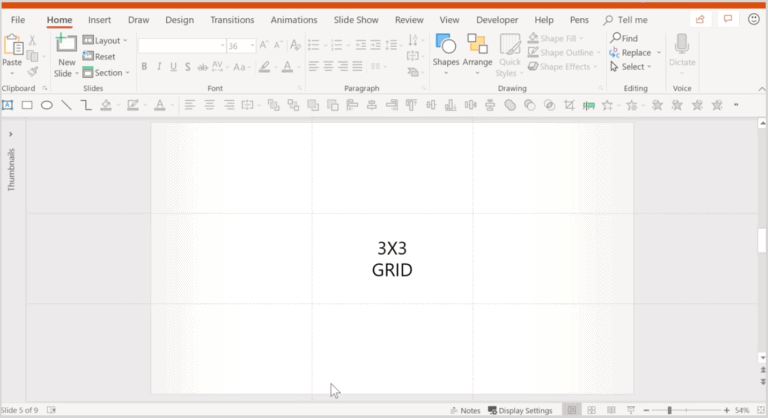
To follow the rule of thirds in PowerPoint slide designs, you need to work with guides. Simply open a blank slide, and right click anywhere on the white section of the slide, click on “Grid and Guides”, by clicking the guides option, it will bring up two thin dotted grey lines on your slide. By adding guides, you can create a 3 by 3 grid system.
To help our users understand this important concept, we intend to write a detailed article on how to work with grids and guides on PowerPoint, and we will update the link in this section soon. Be sure to come back to this article and check this section out.
Now that we’ve seen how the 3 by 3 grid looks, let’s go back to the image on the left.
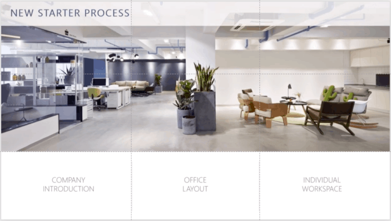
Notice how the image has taken the top ⅔ rd of the slide horizontally. Also note the manner in which the 3 points are laid out in the three grids horizontally. Just by arranging the various elements in the grid system gives a well balanced design to the slide.
We highly recommend learning the grid system using the guides and following the rule of third even if you are a beginner. This will vastly improve your slide designs. The best part is – working with guides is very easy to learn and it only takes a few minutes.
Conclusion
I hope the aforementioned tips will greatly improve the designs of your PowerPoint slides, and help you impress your managers, colleagues and audience. Follow these design tips and you will almost always be able to create an effective presentation.
Our goal on this blog is to create content that helps YOU create fantastic presentations; especially if you have never been a designer. We’ve started our blog with non-designers in mind, and we have got some amazing content on our site to help you design better.
If you have any topics in mind that you would want us to write about, be sure to drop us a comment below. In case you need us to work with you and improve the design of your presentation, write to us on [email protected]. Our team will be happy to help you with your requirements.
Lastly, your contribution can make this world a better place with better presentations. All you have to do is simply share this blog in your network and help other fellow non-designers with their designs!