
There are many reasons that people like to use Google Slides. It could be for a school project, work presentation or just to share information with friends and family.
Whatever the reason, one thing is certain: you want your design to look amazing! If you want an easy way to create a great-looking design for your next presentation then this blog post is for you.
In this article, we will go over 15 tips on how to make an amazing design using Google Slides. Whether it’s your first time creating a presentation on Google Slides or if you’re an experienced professional, these tips are sure to help guide you in the right direction!
So, let’s get started!
Note – if you are strapped for time, simply considering outsourcing the presentation design process to a professional! I’d recommend using Fiverr. It is completely hassle-free to set up and start using. Plus, you don’t need to pay anything to hire a professional. You only pay for the slide design! And, you can start with as little as $5 to $10 per slide!
Tips to Make an Amazing Google Slide Presentation Design!
Since this is going to be an action-packed article with a ton of suggestions, let’s just dive right in with the tips!
1. Create a Compeling Narrative Through a Story Arc
A presentation is only as good as the narrative it holds!
If your presentation doesn’t leave “food for thought” for your audience, they are less likely to remember your presentation, and even less likely to take any action afterward (which is mostly bad news especially if you are trying to convince your investors to give you more money!)
Presentation design goes hand-in-hand with the content that is going to be used for the presentation. Thus, start with a compelling story.
The best way to create a convincing story for your presentation is to use the “Story Arc“.
A “Story Arc” or a “Narrative Arc” is something that has been successfully used by storytellers and writers for ages. The keyword here is “successfully”!
A powerful narrative can not only help your audience understand the intricacies of the subject of the presentation, but it also makes the presentation engaging and entertaining.
The best way to start working on a story arc is to either look at what is the most important aspect of your presentation and how can it be emphasized in a manner that takes the role of a protagonist?
Another way that I’ve used the story arc in my presentations successfully is to work backward. Think of what is the end outcome that you expect, and try to track things backward in order to achieve the end outcome.
No matter what approach you take, if you are able to fit a story arc in your presentation, you’d be golden!
Finally use stories from your life, or what you experienced while working on a project! I’ve seen this works really well and resonates with the audience. Here’s a quick video on tips for using storytelling in your presentation.
2. One Topic Per Slide
Now that you’ve identified the larger part of what you going to cover in your presentation – in other words, the content, you now need to lay it out on your presentation such that it can be consumed by your audience comfortably!
One of the simplest tips to design a better presentation is to make sure that you don’t cramp all the information in a single slide or 4-5 slides! Make sure that you spread out the presentation on multiple slides so that the audience can absorb all the information, but in short bursts, and then move on to the next topic!
A good rule of thumb for a good design is to try and cover just 1 topic on a slide.
I’ve seen this work plenty of times, and I personally also use this technique for my presentations. Simply divide the content of your presentations first into multiple key sections. Then, divide the sections further into key topics that should be covered within that section.
You can do this activity on a sheet of paper or just on the first slide of the presentation. Once you’re done with this activity, you’ll realize that the outline that you’ve just created also serves as the “Agenda” or the “Table of Contents” slide.
Now, all you’re left to do is fill in the information that needs to go under each topic.
You may be wondering how is this a design tip. Well, when you have just one concept present on a slide, it is not only easier for your audience to consume, but also easier to design. You’ll realize this when designing the presentation and thank me later!
Remember, there will be times when you will not have much to say about a particular topic, your slide will look empty, and you will be tempted to add another topic on the same slide. Don’t fall for that. Instead, use images that accentuate the text or the topic of the slide.
3. Start with a Template (Don’t Design from Scratch!)
This next tip might seem a bit obvious to some.
But, the reality is that quite a lot of people tend to miss out on the fact that you can use presentations that already look good, and just customize the slides for your content!
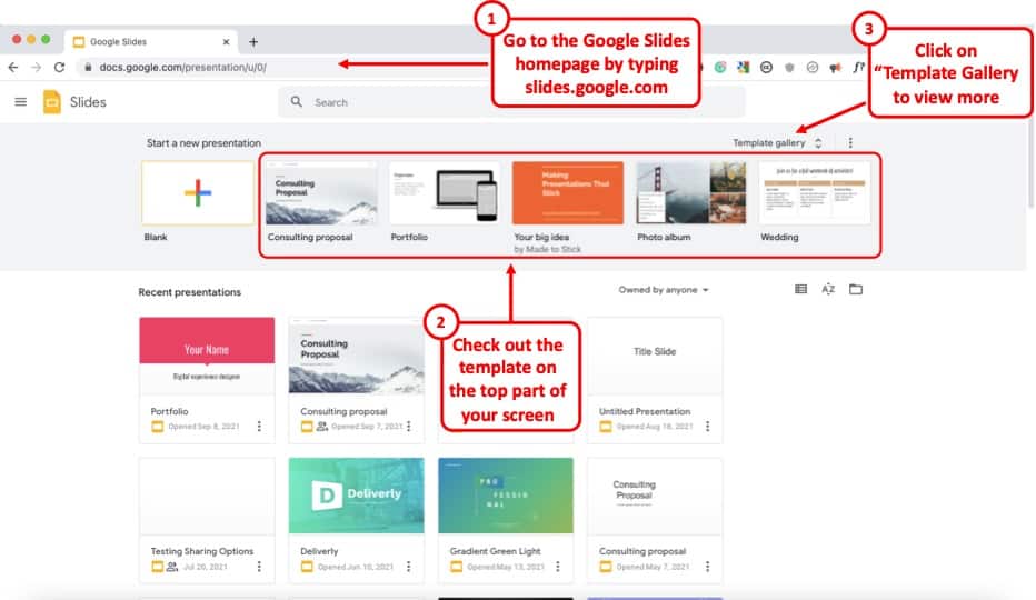
Google Slides already provides you with a number of free templates. Here’s how you can access them –
- First, visit your Google Slides dashboard page.
- Login to your Google Account (if prompted)
- Choose a template from “Start a new presentation” section
- You can also click on “Template Gallery” to view more templates.
The one template that I end up using over and over again is the file name “Consulting Proposal“. It has got a sleek modern design, a good mix of image slides as well as different text placeholder slide layouts for you to easily edit your presentation.
But, feel free to check out other templates and see which one fits your need the best.
The point here is that if you are not great at designing a presentation, you’d perhaps be better off using a template rather than starting from scratch!
4. Use Fonts the Right Way
When it comes to designing a good presentation on Google Slides (or any application for that matter), fonts do play a key role in how your presentation looks!
Thus, it is important to make sure that you use the fonts correctly when creating your presentation.
Here’s what you need to remember when using fonts for your presentation –
- Use Just One or Two Fonts – Don’t use too many fonts in your presentation. Your presentation design will not look good. Plus, using too many fonts in a presentation shows lack of consistency and professionalism in design.
- Combine Fonts – Ideally, just use one font if you are unsure of which fonts work great together. But, you can also combine fonts to make the content of your presentation standout!
If you do want to go with a two-font option, use the Google Fonts tool to identify the font combination.
Here’s how you can find a good font combination for your presentation –
Step 1 – Visit Googe Fonts and Search for a Font
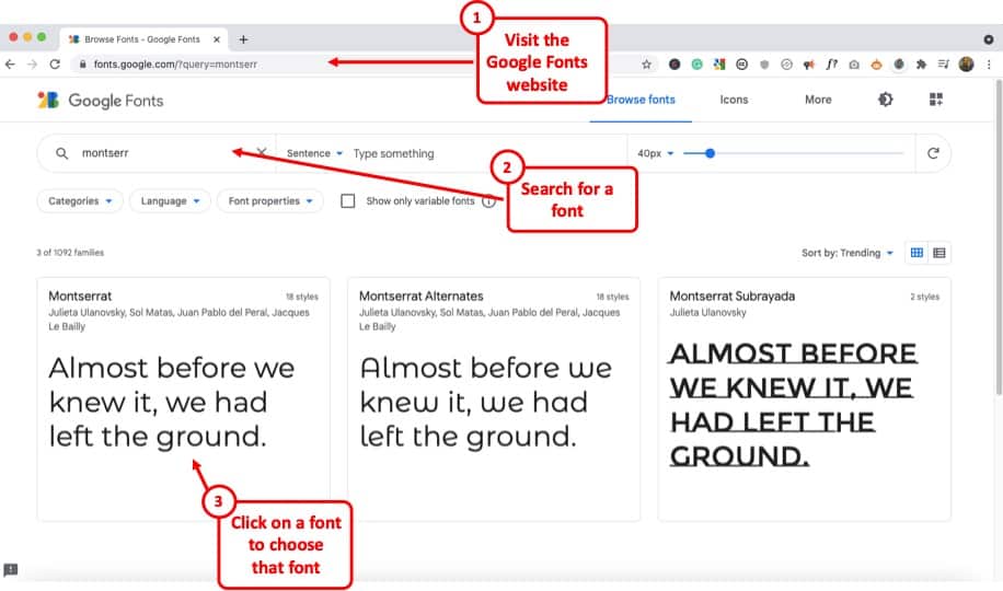
Google Fonts site provides free fonts that are compatible with most modern internet sites and web browsers. Google Fonts are considered the gold standard for sites as these look very modern and are light.
The best thing is – most of them are already available in your Google Slides presentation by default.
So, the first step is to visit the Google Fonts website. Then, search for a font, to begin with. My favorite font is Montserrat. But, you can also go with Lato, Roboto, or Source Sans Pro if you are looking for a Sans Serif Font.
If you are looking for a Serif font, I would recommend using Merriweather.
Step 2 – Choose the Font and click “Pairings”
The next step is to choose a font. You can either type one of the fonts that I mentioned in the search bar and click on it once it appears OR you can also simply choose from the list provided below.
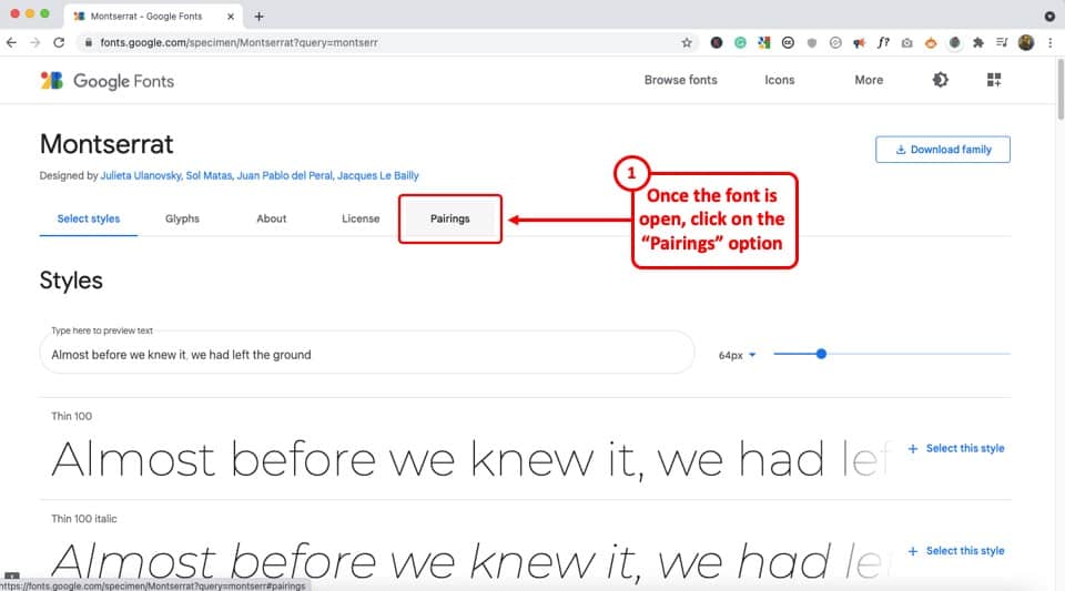
Just make sure that you click on the font that you like to open it.
Once the font is open, click on the “Pairings” tab on the top (as shown in the image).
Step 3 – Choose a Font Pair
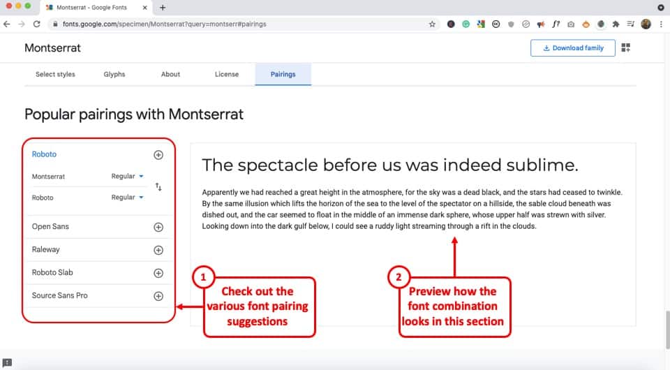
Now simply choose one of the font pairs provided by Google Fonts. You can also click on a font pair to see how it looks on the section on the right.
Play with the options provided and choose the font combination that you like.
Now, simply go back to your Google Slides presentation and change the fonts according to your selection.
5. Choose the Right Color Combination
Just the way fonts are an important part of your Google Slides presentation design, choosing a good color combination can make your presentation look visually appealing, consistent, and professional.
Unfortunately, a lot of struggle with choosing a good color combination. Thus, I highly advise going with a monochromatic color scheme.
A monochromatic color scheme in a presentation provides a variety of color combinations of the same color. This makes your presentation look consistent and professional.
Moreover, using a monochromatic color scheme is a perfect way option for a beginner as it requires the least amount of time and effort to set up!
Check out my other article on using a monochromatic color scheme for presentations to understand the topic in-depth.
Then, also check out how to use the eyedropper tool in Google Slides to implement the color scheme that you end up choosing.
Make sure that you change the color at the theme level in Google Slides instead of changing it on every single slide. This will save you quite a bit of time!
6. Use the Expore Tool to Generate Slide Designs
Once you’ve decided the fonts, color scheme, and theme, and you have the content structured out, you’ve done most of the hard work!
All you are now left to do is create the slide designs. And, to help you with that, make sure that you use the “Explore Tool” in Google Slides.
The “Explore” feature in Google Slides generates slide designs based on the content that is already present on the slide. It is a great way to get a slide designed almost instantaneously!
The “Explore” feature in Google Slides works much as the design ideas feature in PowerPoint.
Based on the content on the slide, it will throw a few suggestions on how the content can be laid out on the slide. You can choose the design you like. If not, you can still design your own slide. But, it is definitely worth trying out first. Pretty cool, isn’t it!
I wrote a detailed article on the Explore Feature in Google Slides. Make sure you check out that article to learn where to find this tool and know how to use it!
That said, one thing to keep in mind is that this feature is still an experimental tool. And, while it is getting better with time, I wouldn’t recommend using it with every single slide.
In my experience, I’ve noticed that using the “Explore” feature in Google Slides works best when you want to create a title slide, a section break slide, or just want to get a few ideas on how the slide can be designed.
7. Apply the 3 by 3 Design Rule
The 3 by 3 design rule, otherwise also known as “the rule of thirds“, is a principle that has been borrowed from photography. But, it is every bit applicable even for slide designs and other design elements!
As per the 3 by 3 design principle, you basically need to divide the visual canvas into 3 equal-sized vertical and horizontal grids with the help of 2 vertical grid lines and 2 horizontal grid lines.
Here’s a video that explains the concept of the rule of thirds for presentations –
Using these grids helps place the content correctly in the grids such that the key message usually aligns with the way our eyes like to see them visually!
The 3 by 3 design principle may seem confusing at first, but once you’ve understood how to use it, you can literally take your presentation design skills a few notches above the rest!
Using 3X3 Grids to Properly Layout Content on your Slides
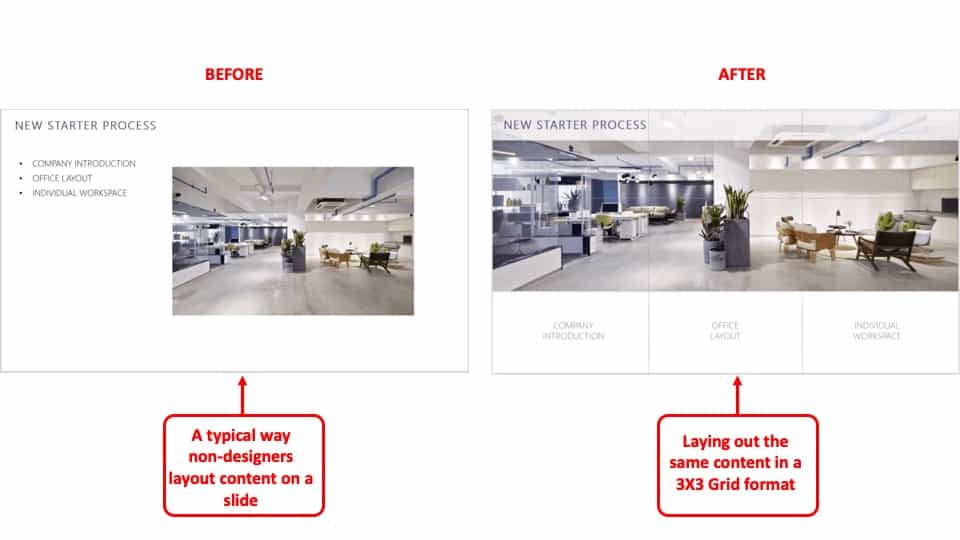
The interesting thing is, you can take the same principle to make it work with elements apart from the images that are present on your slide. And, the results are just amazing!
The picture above shows how most people design their slides (on the left). However, you can literally transform the way your slides look by applying the concept of 3×3 grids to any existing content on the slides! (as shown on the right part of the picture above)
Here’s another video that explains how this concept of 3 by 3 grids can be used to take any existing slides and make them better (if they aren’t properly organized).
8. Use Powerful Images
They say – “An image speaks a thousand words!”. This absolutely holds true when it comes to big impact presentation!
If you recollect any one of the top presentations from Steve Jobs. His presentation was almost always using powerful images with very few words on them.
Using images, as opposed to a lot of text, on your presentation has a few advantages of its own –
- Visual Appeal – Using images makes the slide visually appealing. Think about it – if there aren’t too many objects placed on the slide, the chances of making design related mistakes are also far lower!
- Emotional Connect – Using images creates a subtle emotional connect in the minds of the audience with the topic of the presentation and/or the presenter.
- Audience Focus – When you use text on a presentation, often the audience just reads the text and doens’t want to listen to the presenter. Instead, when using the images, you control the focus of the attention of your audience. Once you have their attention, making a presentation impactful is a lot easier!
- Faster Design Process – In most cases, it is faster to find an image and add it to the presentation rather than think of a way to design a slide to communicate a concept. This is especially true if you have only basic design skills.
If you watch some of the most famous TED or TEDx presentations (know the difference between TED and TEDx presentations here), it is quite common to see presenters using high-impact images with text. Ever wonder why is it so?
Well, one of the most important reasons is that you are able to control the attention of the audience!
Now, if you are wondering how to find images for your presentation, keep reading as I’ve got some great recommendations for add-ons later in the article!
9. Keep the Text on the Slide Readable
If using images for most slides is not the way for you, then this section is going to be quite important!
In fact, even if you do plan to use just images on your slides, there may still be a few slides where you will need to have some text. If so, make sure that the text on the slide is readable!
Make sure that you don’t use text that is too small to read.
As a general rule – the further the audience is going to be away from the screen, the larger the size of the text!
Here’s what to remember for the size of the text on the slides –
- Presentation seen on a computer screen – If the presentation that you are designing is going to be seen on a computer screen (either over an email or a zoom call), then make sure that the font size used for the presentation is not less than 16 points.
- Presentation seen on a large screen – If the presentation is going to be delivered in an auditorium, then it is recommended to use a font size no less than 30 points. For the rest of the situations, anything in between should be fine!
Also, make sure that you don’t use too much text on the same slide. Remember – you only need to cover one key topic on one slide.
It is totally okay to just use one word in the middle of the slide, and talk about that topic rather than using text from a complete word document on a slide!
If your audience will have to squint to read what is written, it just creates a bad user experience and they quickly lose interest.
Also, for the above reason, don’t include everything on the slide that you plan to say! If you do so, you may come across as a person who is just reading from the slide! Most importantly, the audience is going to end up reading the text from the slide faster than you speak, and end up losing interest in the presentation!
10. Ditch the Bullet Points (Use Infographics Instead!)
Using bullet points on a presentation is so 1990s! It’s just not the way good presentations are given anymore!
If you want your presentation design to look good, make sure that you get rid of bullet points. Instead, you can either use images, icons, or even infographics!
I’ve written an entire article on how to use infographics in Google Slides where I also talk about SmartArt and charts in Google Slides. Make sure you check out that article!
There are a ton of different ways in which you get infographics for Google Slides. I’ve talked about that also in the same article that I’ve linked above.
Likewise, you can also use icons instead of bullet points. Although adding icons to Google Slides is not an option that is available by default, there are a few ways you can work around this problem. For instance, you can use an add-on like “Flaticon” that provides free icons for Google Slides!
If you are wondering how to create a slide with bullet points and use icons or other methods, here’s a good example of an actual client slide that I redesigned –
As you can see on the image, simply using icons and structuring the text to give proper hierarchy to the information can make all the difference to the design of the slide!
In case you don’t want to use icons, you can also use numbers with circles, and use a similar design instead of just adding bullets to your presentation. If you do so, your presentation will still look good!
11. Avoid Using Just Table or a Graph
The next tip to remember is to avoid using just a table or a graph on a slide. Make sure that you also include a few points that act as key takeaways from the information that you provide.
Using just a table will present a lot of information on a single slide. This will definitely cause an information overload. And, even though your audience may be able to assess what is being presented to them, it is important to either highlight key pieces of information in the table or a graph.
Alternatively, you can also add a couple of lines of text indicating the key learnings from the data set.
Don’t get me wrong, it is important to have data sets on a presentation if you have one! But, just make sure that you also highlight key pieces of information that your audience should pay attention to.
12. Keep Animations and Transitions Subtle
Another design tip that you should keep in mind is the use of animations and transitions in Google Slides.
You want to make sure when using animations in Google Slides, you don’t add any funny movements. Think old school when using animations and transitions in your presentation.
Any additional movement or sudden transitions can distract the attention of the audience from the core topic and the messaging of the presentation.
So, make sure that you keep the use of such animations or transitions to the minimal!
13. Use Professional Google Slides Templates
If you find that the free template doesn’t have enough slide layouts for your presentation or doesn’t really fit the topic of your presentation, you may want to consider using professional templates!
There are a ton of different ways you can get templates for Google Slides. Unfortunately, most of the free options (and even most paid options) have outdated designs!
My personal favorite method for getting amazing Google Slides presentation templates is using Envato Elements.
The best part about using Envato Elements is that not only does it provide you with the best-in-class designs for your templates, but it also provides you with an option to download an unlimited number of presentations! (yes, you hear that right!)
Moreover, the pricing of Envato Elements is also really affordable! All you need to do is click on Envato Elements to visit the website, view the templates, and click on the “Get Unlimited Downloads” button on the top.
You will be prompted to sign up and pay a subscription. Just go for a monthly subscription and pay for one month (You can easily remove the payment method and cancel your subscription anytime).
Once you’ve logged in, simply cancel your subscription. Your subscription will be valid until the next date of renewal even if you cancel it.
Now, for the one month that you’ve paid, feel free to download all the templates that you like including templates for Google Slides, and PowerPoint!
14. Use Add-ons for Faster and Better Designs
One of the challenges with Google Slides, as opposed to some of the most reliable presentation design software, is the limited number of features it offers.
I suppose we should not really be complaining about it given that we do get a great presentation design application for free along with several additional advantages with Google Slides! That said, you do feel the need for a few pro-features that PowerPoint has to offer.
However, one way to fix this problem is to use add-ons with Google Slides!
Using add-ons allows you to use third-party tools and bring additional functionalities to your Google Slides presentation!
Add-ons on Google Slides are easy to add. Simply go to the Google Marketplace, and search for the add-on that you would like to add. Install it, and you are done!
Check out my complete guide on using Add-ons on Google Slides where I not only talk about how to use add-ons in Google Slides, but I also provide you with my personal favorite top 5 recommendations of add-ons that you should be using in Google Slides!
15. Hire a Professional
Well, the last tip is not so much as a tool that you can use on Google Slides. But, it is a great hack to ensure that you create great presentation designs!
Simply hire a professional to do the design work for you! You may be wondering that hiring a presentation professional might be difficult. However, that is not the case.
You can easily find some really good presentation designers on Fiverr, and you can start at as little as $5 to $10 dollars per slide! I’ve personally used freelancers from the site, and although finding a good freelancer may take you 15-20 minutes, you can easily outsource your work and let the designer worry about the rest!
The best part is – you don’t have to pay a single penny to hire a professional. You only pay to get the work done!
There are a ton of other platforms to hire professionals that can design a good presentation for you. However, I have found Fiverr (especially for presentation design work) and Upwork to be the most effective.
A Few Things to Remember When Delivering the Presentation
Once you have created an amazing Google Slides presentation, you are perhaps ready to deliver the presentation. However, I’d like to also share a couple of tips that can be helpful when you plan to give the presentation!
So, here they are –
1. Use a Presentation Remote
It doesn’t matter whether you are giving a presentation in an auditorium or online through Zoom or Microsoft Teams.
Using a presentation remote helps you keep your hands free and allows for free movement and hand gestures. This does help engage with your audience.
Check out my other article on using presentation clickers with Google Slides where I provide you with a few tips and recommendations on which remote you should go with.
2. Use the Q&A Tool in Google Slides
A unique feature that Google Slides provides is the Q&A tool. This is great especially if you are delivering a webinar-style presentation or if you are simply addressing a large gathering.
This tool allows your audience to send questions during the course of your presentation. Then, at the end, you can simply view the questions in the Q&A session and answer them one by one!
It is a great way to deliver an engaging presentation using Google Slides!
Credit to cookie_studio (on Freepik) for the featured image of this article (further edited).